30.3.09

ANALYSIS OF PSAT COLLECTIONS

2002 Fall RTW


From my dearest groupmate's blog
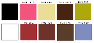
In this collection, it also contains the black and white colour and the main colour is brown and over half of the outfits only use black and white. The other half outfits use brown as theme. This collection use mono-chromatic scheme and achromatic scheme to creat a nature and harmony mood of the outfits. And there are many outfits in formal style and very simple design so the collection use some base colour rather than some sharp colour.

2001 Fall RTW


FROM MY GROUPMATE


Compared with the collection of 2000 Fall RTW, this collection use less hues and the main focus are brown and black that create a romantic styles. For the jeans blue that is very contrasting on the collection and it is a complementary colour of brown that appears on only 2-3 outfits can create a special mood and reduce the boring mood. But also they can be harmony.


2000 Fall RTW


from my dearest classmates

from my groupmate's information, I have found that in the 00 fall RTW collection, the designer use many hues in this collection. As I know that the theme color is according to the middle east national colors and black, the collection contain many colours that are usually seen in the middle east women's clothing. The pattern also like the clothing of middle east clothing.But there is no one colour is dominat the collections so that this collection focus on the design rather than the colours.




27.3.09

In one day, I have found that our clothing is applied to the color scheme learned in the lesson with my classmates and so we took a photograph immediately. In our clothes, there a only one hue -- blue but different intensity. We have a conculsion which is mono-chromatic scheme. I think it is very interesting that we can apply the thing in our life that learned on the lessons. It is very useful for us to mix and match of our clothing and start being a fashionable guy.^^

24.3.09

Advertising Of DOLCE & GABBANA

2007


2008


I have found that the advertisement of DOLCE & GABBANA is very special and impressive compared with other similar brands. Actually, I like them very much. They have unique theme in every season, the styles are very bold and they have some meanings at the back such as sardonicism. The ideas usually are very sexy and crazy those create a clear modern image of the brand. The colors of the clothing are matched with the theme (scene) and also the post of the models, these are very wonderful and creative. It is interesting that there are both men and women whether in a women collection’s ads or men’s, I think they want to promote a sex image that match their target market --- mature and modern. Also, this can create noise in public such as in 2007, one of the ads are forbidden to publicize as they related to humiliation of females. So, I think DOLCE & GABBANA is a very creative and unique brand that everything may be occurred on this brand. So that it a bit difficult to forecast the color as the variability of that is much high.
"Dolce & Gabbana was publicly criticized by Britain's advertising watchdog Advertising Standards Authority (ASA) in January 2007, for an advertising campaign showing models brandishing knives.
Following complaints from consumers' groups in February 2007, Dolce & Gabbana pulled an advertisement in Madrid, Spain and Paris, France that showed a man holding a woman to the ground by her wrists while a group of men look on. Spain's Labour and Social Affairs Ministry branded the campaign as illegal and humiliating to women, saying the woman's body position had no relation to the products Dolce & Gabbana were trying to sell.
[3] Italian publications followed suit, banning the ad." from wikipedia.


21.3.09

lec7 class exercise


I use the black colour as the main colour of the shop. As the goods of this shop is very sharp and they will be easily located when contrasting by the black colour. I arrange the products nearly which are in the same colour that can be convenient for the customers and is more tidy.The colour can creat a modern and mystical mood in this shop.

7.3.09

The colour scheme of Burberry

a) The original pattern

This color pattern is the original and the most popular pattern of Burberry. It can be seen as the symbol of Burberry. This pattern has 3 colors (black, white, khaki, red), you can see that the proportion of the khaki color is the biggest. The red and khaki color is the mono-chromatic scheme color. And black and white is the achromatic scheme colors so this pattern is the mixing of mono-chromatic scheme and achromatic scheme colors. I think the achromatic scheme colors is usually appear in the Burberry’s pattern. And it m
ixes with other colours to produce a regular pattern and use to emphasize the unique pattern of Burberry.


b) red lines
I have find that the red lines should be present in all pattern, so the theme colour of each pattern may be matched with the red color. For example, from the below picture, there are different theme color of Burberry. For the green one, the green hue is a complementary color of red and for the blue one, the blue hue is the triadic color of red. So every theme color should have a relationship with red color and the red lines.

4.3.09

MY Class excersise and GROUPMATES *V*

Before the lesson:

After the lesson:


I use yellow ,orange and green colour as the main colour in my collection and this is analogic colour scheme.

Chau Wan Yu http://www.08293043data.blogspot.com/


Ng Shuk King http://www.08286935d.blogspot.com/


So Yuk Kwan http://www.itc08318881d.blogspot.com/


Yip Wing Yan http://www.08358817d.blogspot.com/


Chan Sui Pik http://www.08156348d.blogspot.com/


Cheung Hiu Tung http://www.08092011d.blogspot.com/


Hui Shan Ling http://www.08078766d.blogspot.com/


Yeung Hoi Chung http://www.08262020d.blogspot.com/


Nancy Kwan http://08282537d.blogspot.com/